My Top 5 Squarespace CSS Tricks
If you’re reading this, you’re probably already aware of how awesome Squarespace is for building websites. With a simple drag and drop interface, Squarespace makes it easy for anyone to build beautiful websites without coding knowledge. However, just putting a little effort into some custom CSS can really take your Squarespace site to the next level. In this blog post I’m going to share with you some of my top 5 favorite CSS tricks for Squarespace.
Before we drive into the details, it’s important to lay some groundwork. All these tricks I’m about to share are based on using with the Squarespace 7.0 Brine template family. I’m not saying they won’t work on a 7.1 site or another template, but you might need to tweak a few things in order for it to work right.
As a side note, Brine is the best template family in Squarespace and I highly recommend you switch to it. That’s a whole other topic for another blog post, but it’s worth mentioning. See if your template is in the Brine family here.
How To Use Custom CSS In Squarespace:
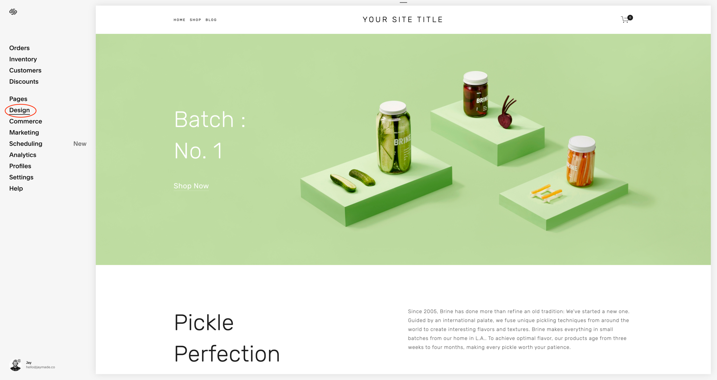
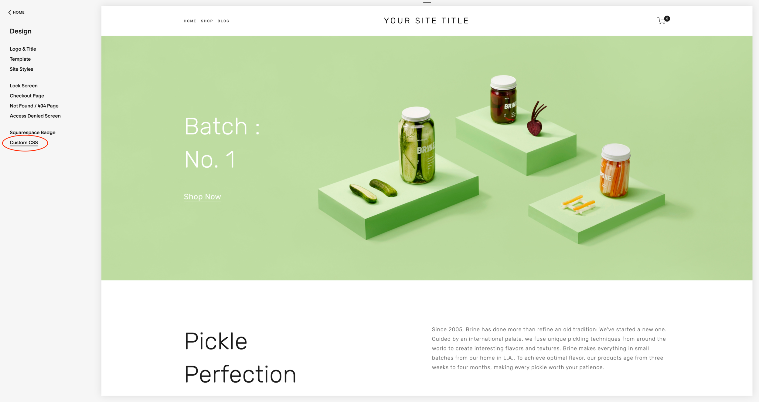
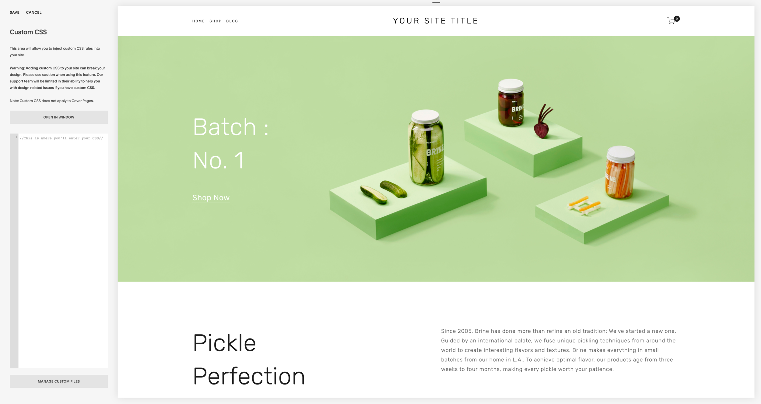
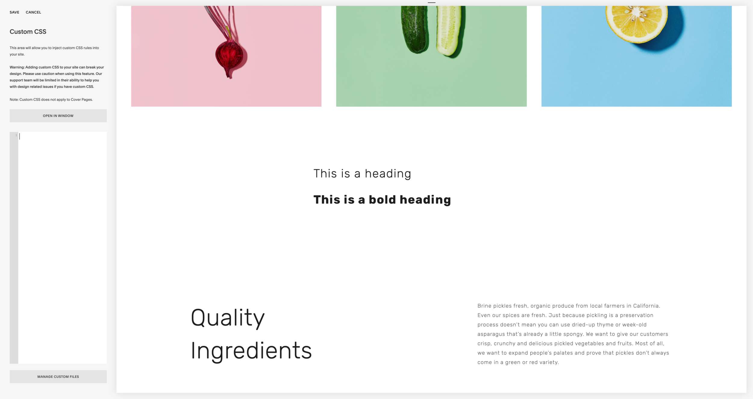
If you’ve never used CSS in Squarespace before, this might seem a little complicated. I promise it’s not! Simply navigate to Design > Custom CSS. Here you’ll see a window where you can enter CSS. In most cases you can copy/paste the snippets I’m including below, and with a little modification you’ll be good to go! And don’t worry, all this is reversible, so if you mess something up just delete it and you’ll be back where you started!
1. Manual Hypenation
This CSS snippet is the very first thing I add to a Squarespace site, no matter what! By default Squarespace chooses to hyphenate words that get cut off by screen size. In almost no situation does this look good, and it can be especially ugly when it happens to a big, bold title. Here’s the CSS:
p, h1, h2, h3 {
  -webkit-hyphens: manual !important;
     -moz-hyphens: manual !important;
      -ms-hyphens: manual !important;
          hyphens: manual !important;
}
By inserting element selectors we can tell Squarespace which font sizes we want to apply this to. By default I’m using p, h1, h2, h3 which covers the Body, Heading 1, Heading 2, and Heading 3 fonts. If you wanted to apply this to only one font, you just need to use its corresponding selector.
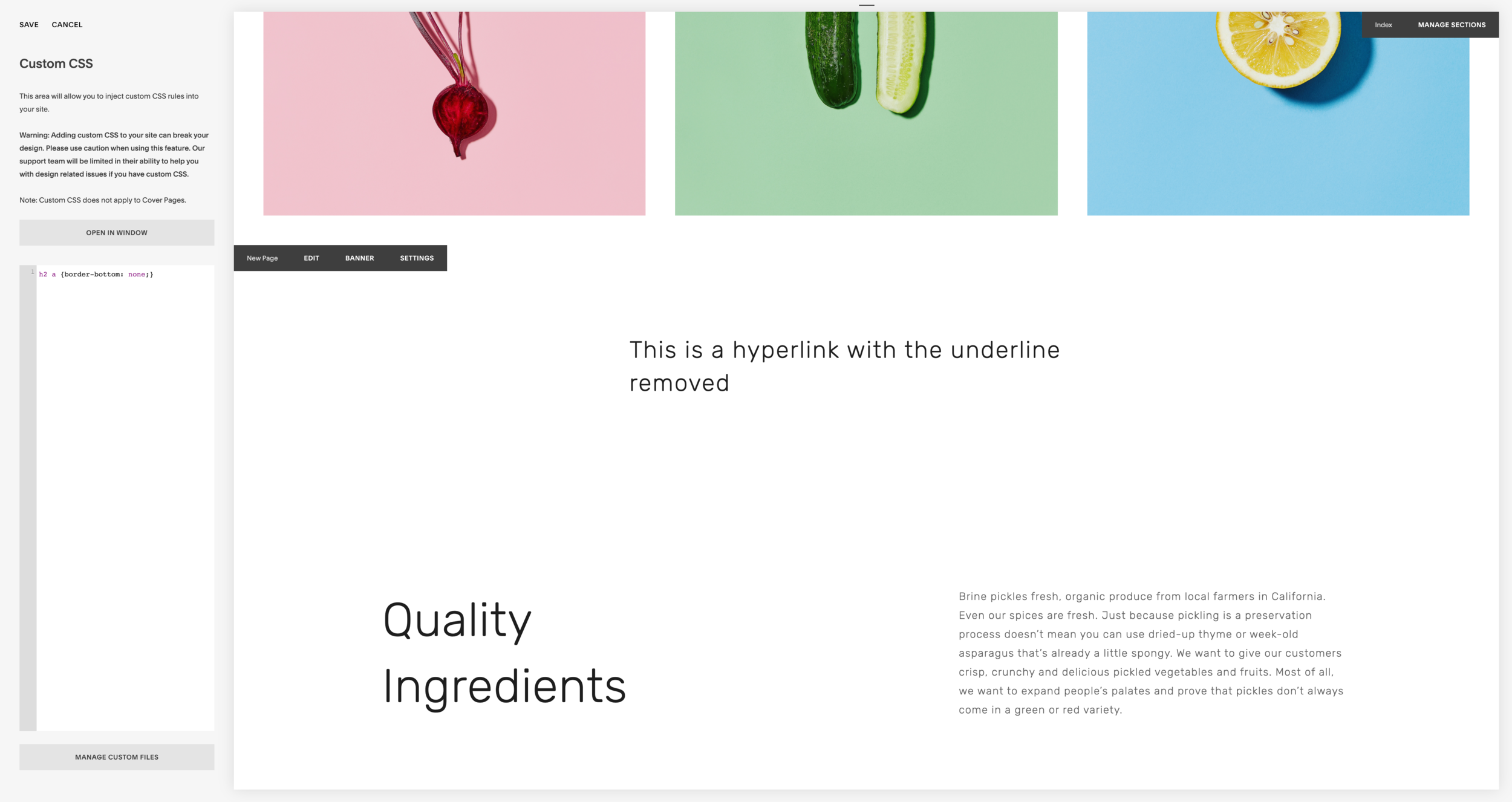
2. Remove Hyperlink Underline
When inserting a hyperlink in a text block, Squarespace automatically underlines the text. This can sometimes be useful to indicate a link (especially if links are the same color as the other text) but sometimes it takes away from the clean appearance of a text section. To remove hyperlink underlines, we can simple insert this CSS:
a {border-bottom: none;}
By using the “a” selector you’ll only target body text. If you wish to target a heading, insert its selector before ‘a”
For example, I’m using “h2 a”

3. Assign A Different Color To Bold Text
This one is really fun and it’s a great way to add new depth to Squarespace’s limited typography options. I personally love using it within bold headings but it can really be used anywhere you like! Here’s the CSS, set up for Heading 1:
h2 strong {color: red;}
As you can see, we use the h2 selector to tell Squarespace we only want to apply this change to Heading 2. Then, we use the strong selector to tell Squarespace we only want this to apply to bold Heading 2. If you’d like to change this up, you can edit the selector to another font (h1, h3, p, etc) and change the color by typing one in like I did, or inserting a hex code or other color value.

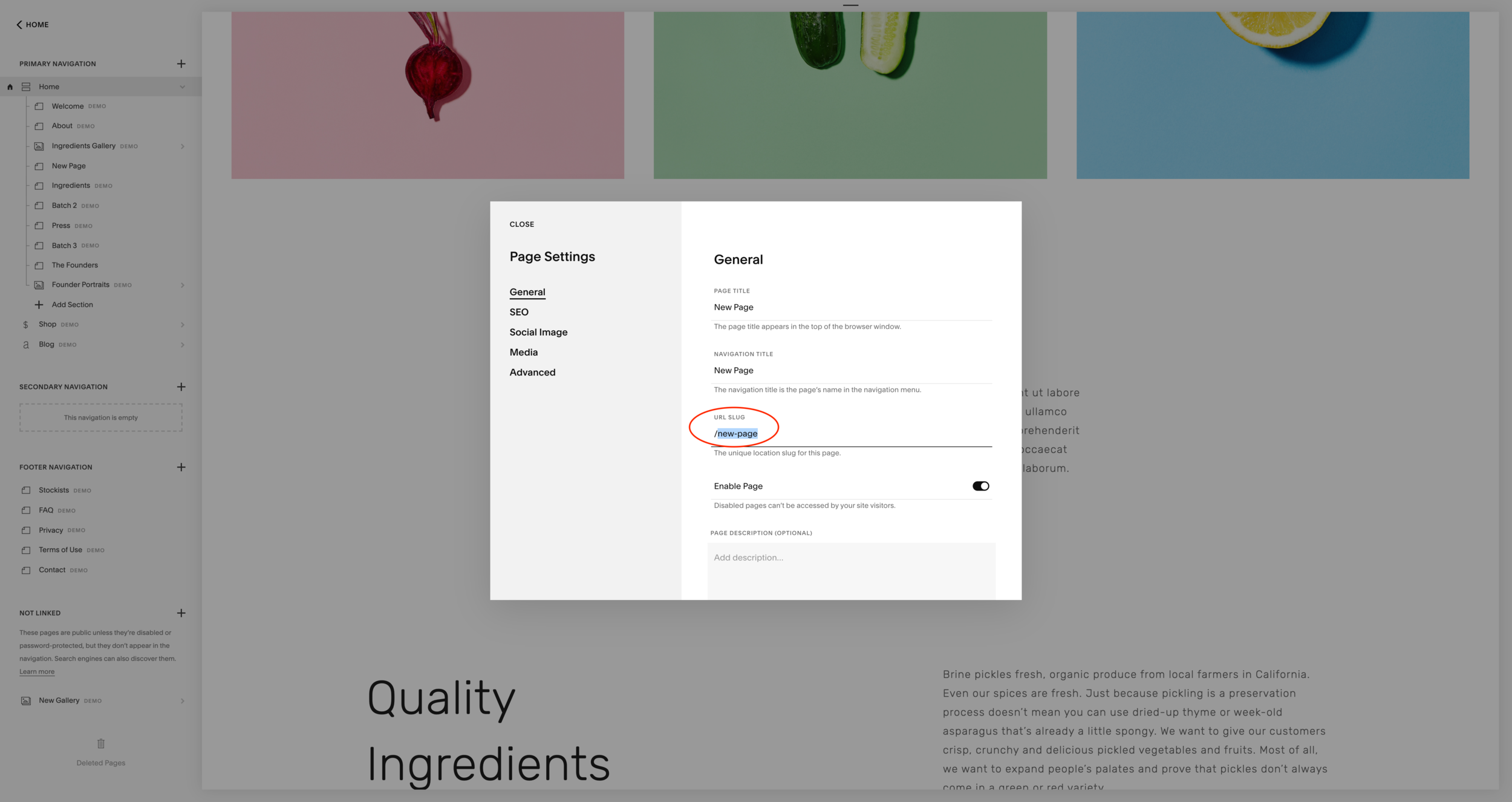
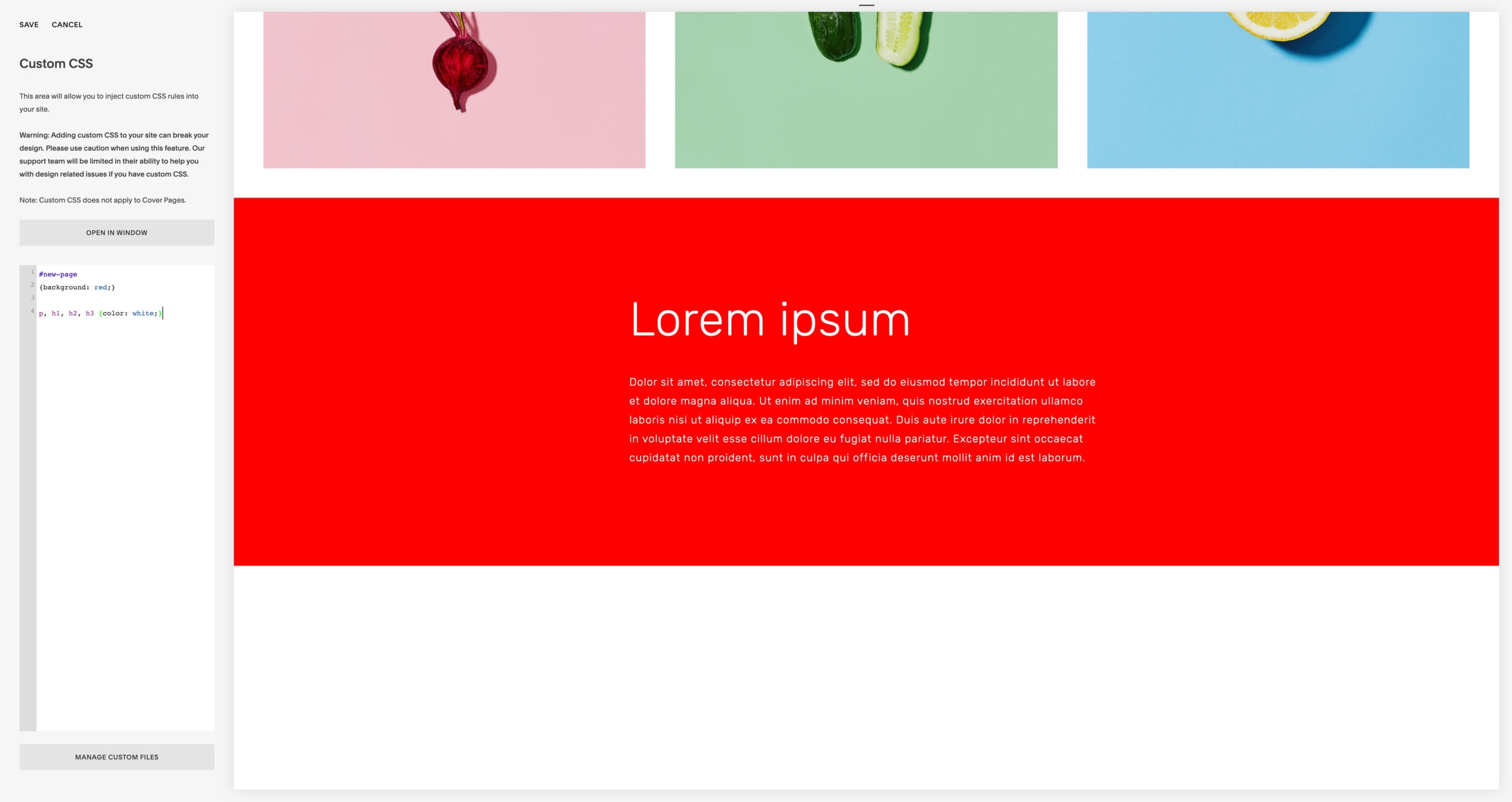
4. Change Background Color On A Specific Index Page
I use this CSS on pretty much every site I make. I’m not sure if there’s ever been a site I made that didn’t use it! Being able to change the background color on a specific index page is an awesome feature to give more visual separation between index sections. Here’s the CSS:
#your-index-url-slug

{background: red;}
The first thing you need to do is identify the index page you want to apply the change to. To do this, click the setting icon on the page and copy your url slug. Then, insert your url slug with a # in front of it. I’ve inserted an example to show what this should look like. This tells Squarespace to apply the CSS to this page only. Next, change the color to your desired one. I used red as an example but you can type in another color or insert a hex code or other color value.
Depending on your color choice, you might need to change the color of the fonts on the page. Read on to the next step to see how this is done.


5. Changing Font Color On A Specific Index Page
You might already have an idea of how you could do this based on the previous tips I shared, but I wanted to go over this specifically in case you need more clarification. Here’s the CSS:
#your-index-url-slug

p, h1, h2, h3 {color: gray;}
Like above, insert the tag for your index page so Squarespace only applies the CSS to that page. By inserting element selectors we can tell Squarespace which font sizes we want to apply this to. By default I’m using p, h1, h2, h3 which covers the Body, Heading 1, Heading 2, and Heading 3 fonts. If you wanted to apply this to only one font, you just need to use its corresponding selector.

To Summarize:
Those are some of my most frequently used CSS tricks! Hopefully you found this helpful and can use these ticks creatively to add some extra spark to your Squarespace site. These tricks are very simple and barely touch the surface of what CSS is capable of. I think they make a great introduction to get you more familiar with it though!