How To Drop Cap Text In Squarespace
A drop cap (dropped capital) is a large capital letter used as a decorative element in the beginning of a paragraph. Although it may be considered an older style choice, it adds an interesting element not commonly seen online, and it creates a strong visiual anchor for the start of your paragraph. Creating a drop cap in Squarespace is quite easy to do, but it does require a little use of custom code and CSS. This may look a little complex if it's your first time using custom CSS in Squarespace, but I promise it's actually pretty easy once you spend a little time learning how it works. Read on to see how you can add this to your Squarespace website.
Adding A Drop Cap In Squarespace
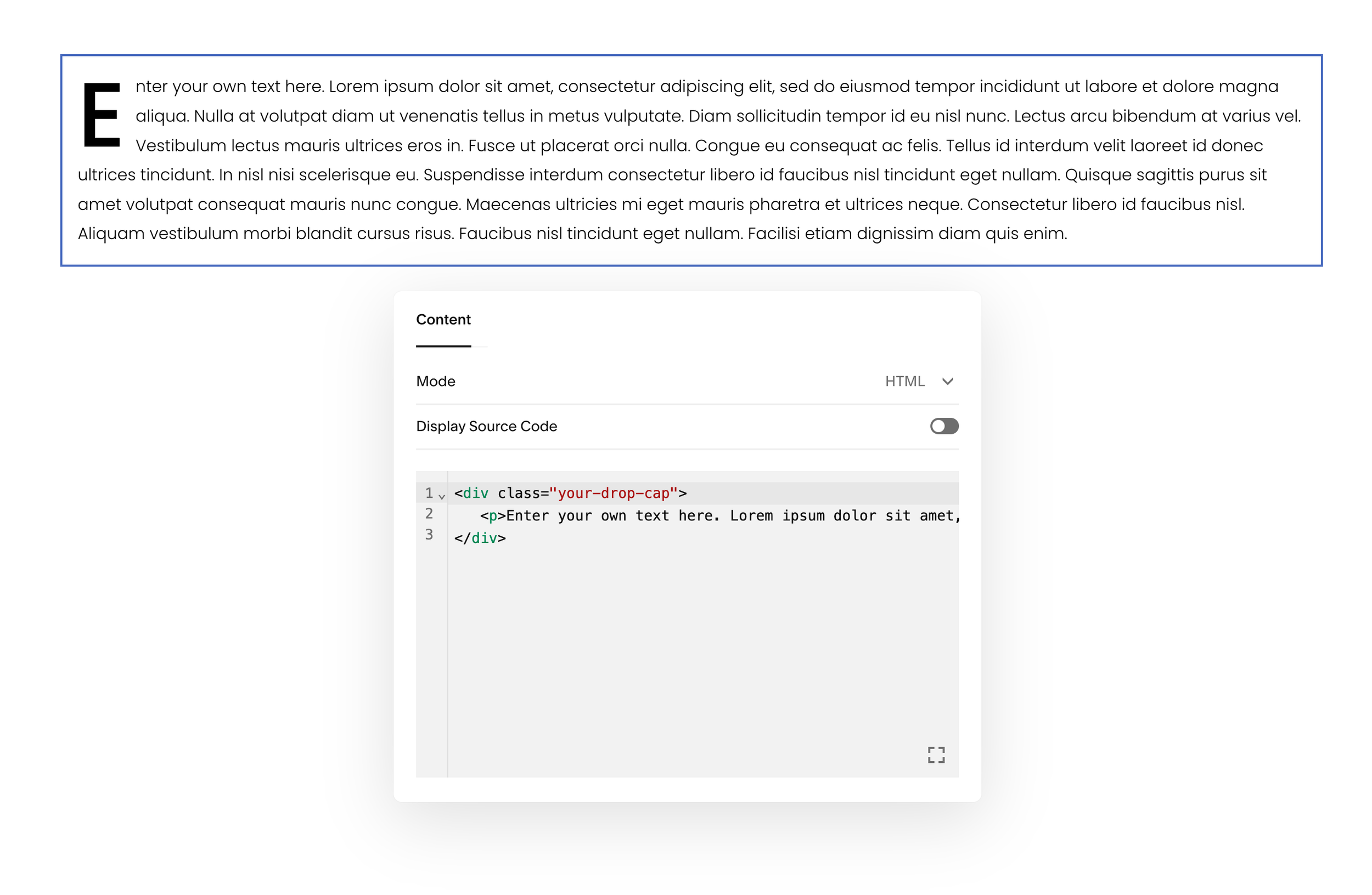
1. Add a Code Block to the page you’d like your drop cap on.
2. Copy and paste the code below into your code block. Update the text between the <p> tags accordingly.
<div class="your-drop-cap">
   <p>Enter your own text here.</p>
</div>
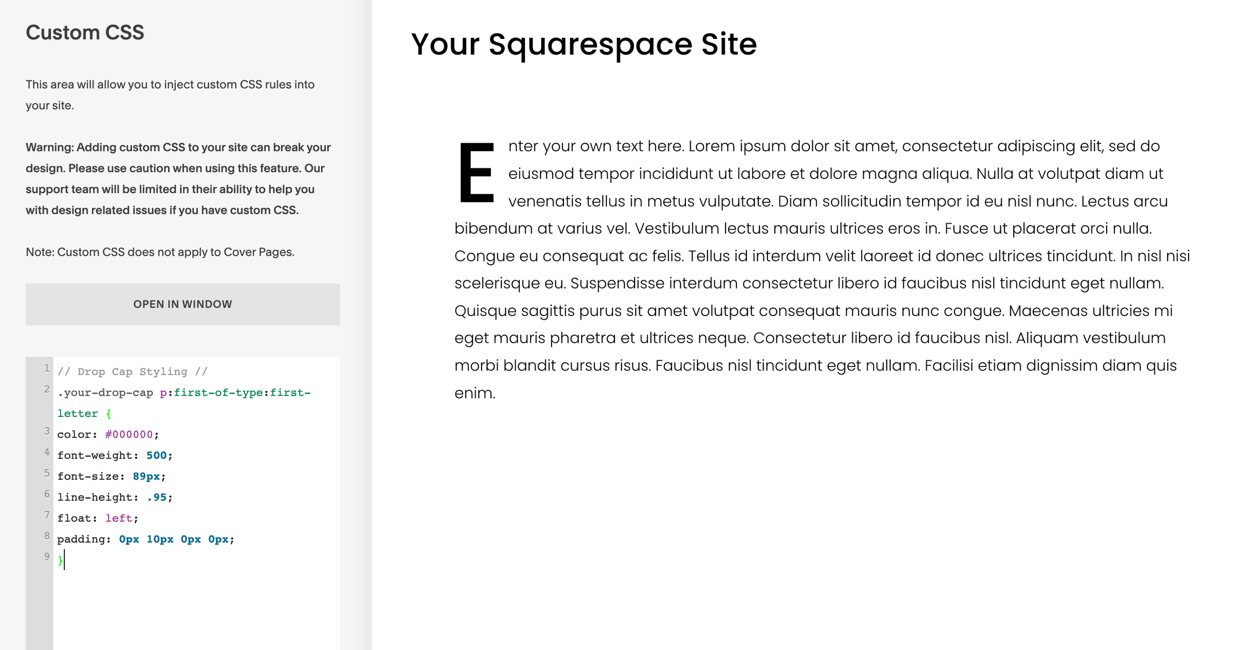
3. Go to the Custom CSS editor in Squarespace. Paste the below code into the Custom CSS.
// Drop Cap Styling //
.your-drop-cap p:first-of-type:first-letter {
color: #000000;
font-weight: 500;
font-size: 80px;
line-height: .95;
float: left;
padding: 0px 10px 0px 0px;
}
4. Adjust the code accordingly to suit your style. You can tweak the color, weight, and size by modifying the above code.


Using The Drop Cap In Squarespace
After completing the above steps to add a drop cap to your Squarespace site, you can continue using it elsewhere on your site by just pasting in the same code from step 2.
If you need a second style of drop cap you can create another version by modifying the class name. This can be a great solution if you need a drop cap on a different background color section where the first style doesn’t work.
Here’s the same code as above with a modified class name:
<div class="your-drop-cap-2">
   <p>Enter your own text here.</p>
</div>
You’ll also need to add another Custom CSS snippet in Squarespace to support the alternative class name. Be sure to keep the first one we used in step 3, and just add this one in addition:
// Drop Cap Styling //
.your-drop-cap-2 p:first-of-type:first-letter {
color: #ffffff;
font-weight: 500;
font-size: 80px;
line-height: .95;
float: left;
padding: 0px 10px 0px 0px;
}
In the CSS above I set the drop cap color as white, so now you have two versions that will work on a variety of background colors! Of course you can modify these colors as needed, and you could make even more versions following the same format as I used, but I just wanted to share both of these options so you could see how it works!

